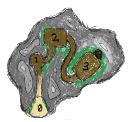
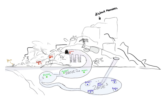
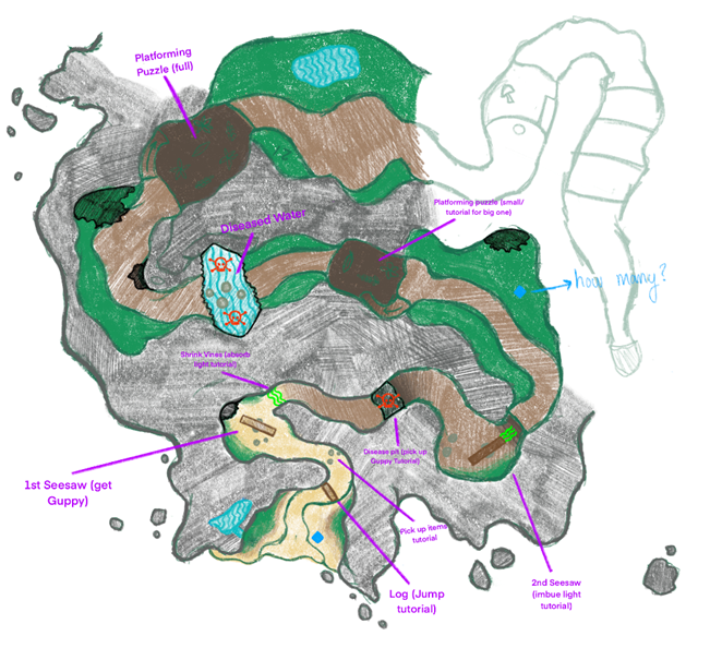
When creating a world that has natural shapes it’s important to think about how the space will be organized. While making the second concept for the island, Land of Lights followed a linear game structure. Still, I wanted the player to feel like they were able to wander and explore the island. Though the area the player can walk is limited, I created the illusion of a more dynamic space by creating twisting and turning paths, and considering the player’s line of sight when sketching out the walkable space. I try to make sure that the player cannot see further ahead into the level than they need to. This helps to limit what the player sees, which can help emphasize elements we want them to focus on and prevent them from being overwhelmed with information.
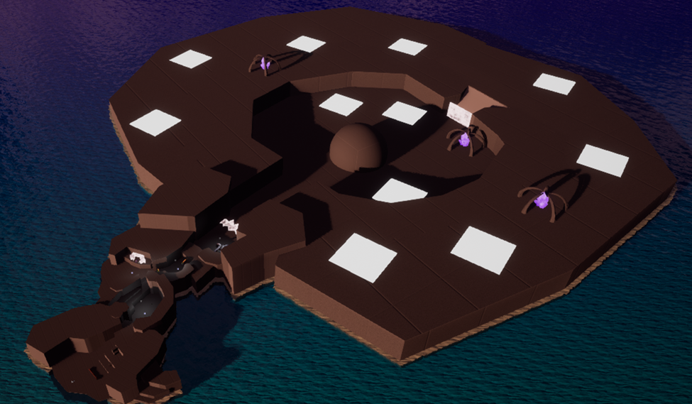
Of course, one of the most important elements of concepting new designs is understanding that they are subject to change. During the concepting process, ideas and elements are fluid tools in the decision-making process and may be discarded if they no longer align with our final vision. Our team has explored several concepts for our island design and layout, each time getting closer to our final goal. You can see in the images shown below how much the layout of the island has changed with each revision.


Through playtesting and review we discovered flaws in the designs and began ways to resolve the issues. After some of the feedback we received, we decided to completely change the island layout once again.

Finally, we are currently making the switch from linear to nonlinear gameplay, keeping a general order for the player to explore the island, but adding more freedom in the order that they approach and complete each puzzle.
